New CI and Website Launch
From “Hummel” to AITHON Robotics — why we’re now yellow and black
17.11.2025
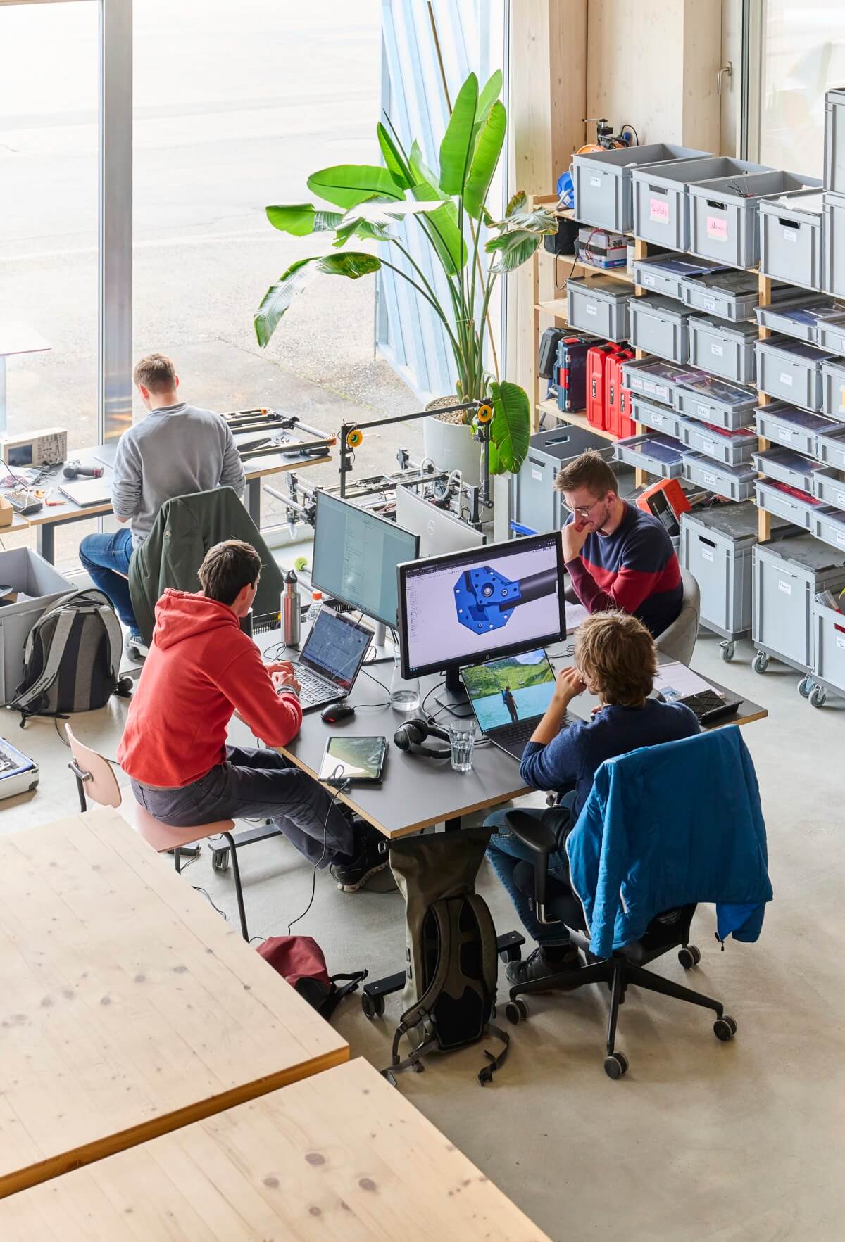
With the launch of a new website and visual identity, AITHON Robotics marks its transition from a university research project to an ETH Zurich start-up project.
The new design represents this next chapter and tells the story of how a simple file name became our brand.
Why yellow and black?
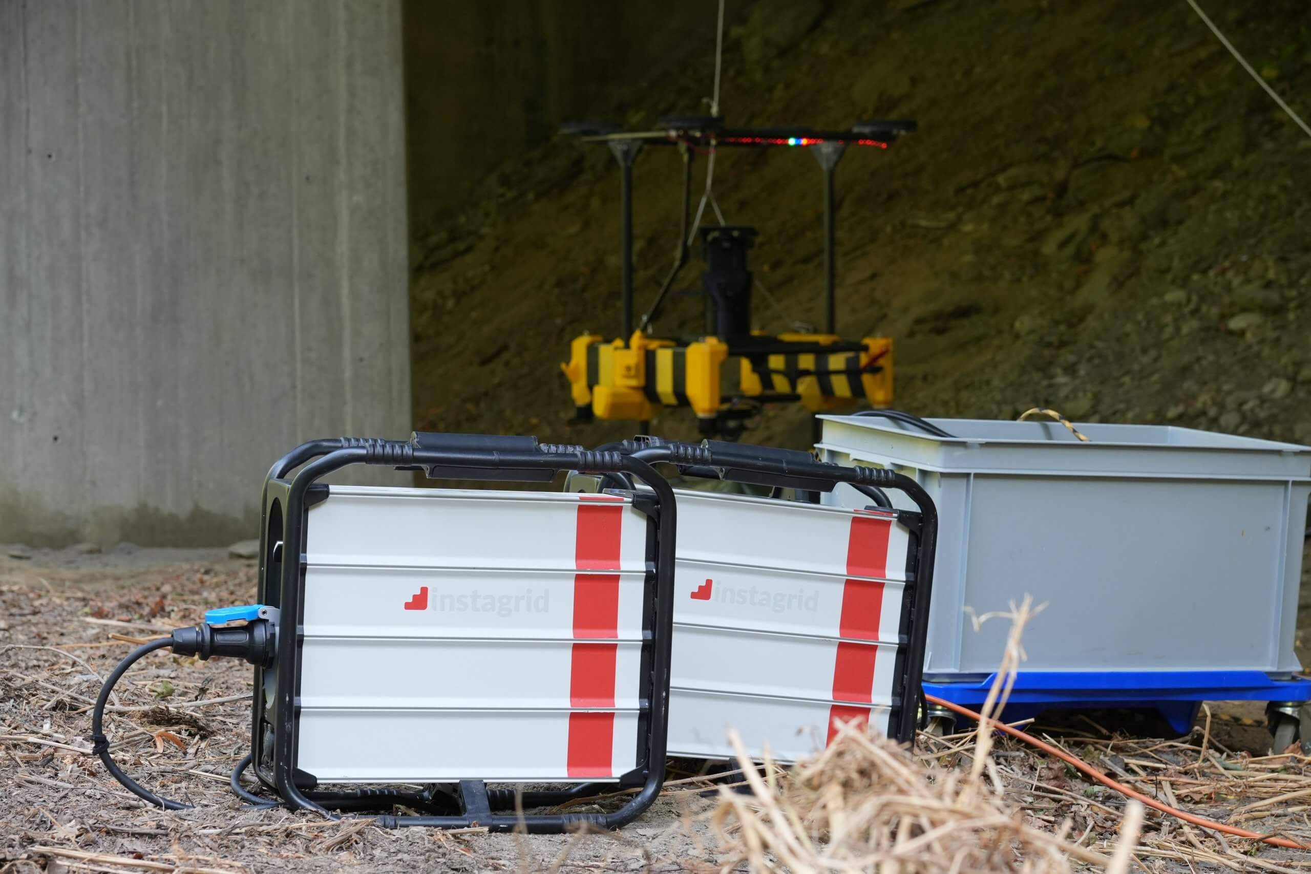
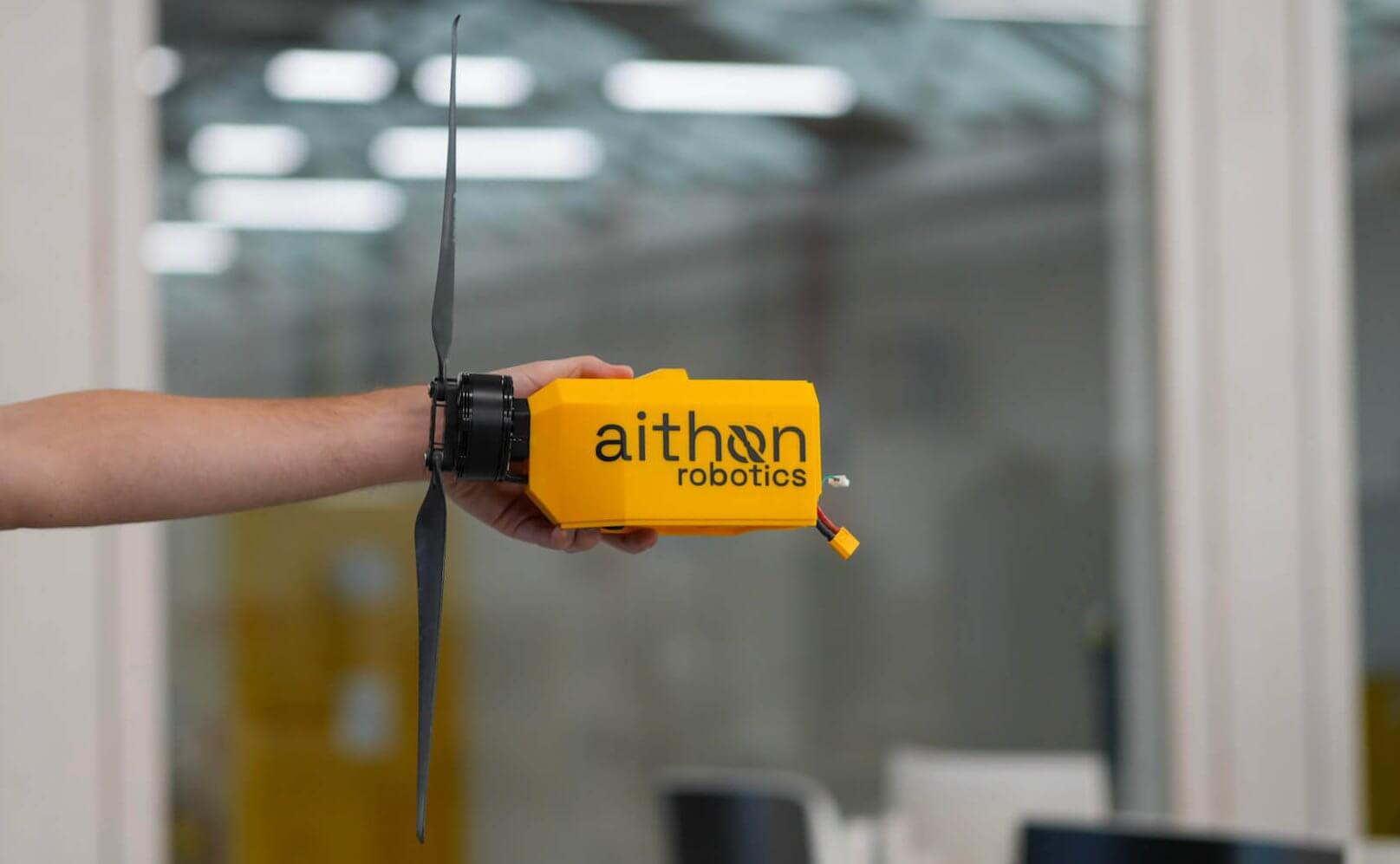
If you’ve met us at a demo, you’ve probably recognized our drone right away: the yellow-and-black one.
These colours aren’t just for looks; they carry our story. The very first simulation file we ever ran was jokingly named “Hummel” (German for bumblebee): a friendly, powerful creature that, by all logic, shouldn’t be able to fly… yet does.
That same spirit of defying assumptions through engineering drives AITHON Robotics today.
Over time, the drone’s distinct design became our hallmark. With this rebranding, we’re making that connection official linking the drone and the AITHON brand in a clear, recognizable way.
The bold contrast of yellow and black mirrors our technology itself: visible, reliable, and built for performance in the toughest environments.
A clearer, more structured design.
Our new logo reflects that same mindset. It’s now more structured, focused, and precise; less playful, but more confident.
It represents what AITHON stands for: clarity, reliability, and purpose-driven engineering.
Every element of the new design from the logo to the typography and colours is built to strengthen recognition and to communicate what defines us: engineering excellence with a clear identity.
You’ll see the new look across all our platforms from our redesigned website to our field equipment, presentations, and communications.
The “Hummel” spirit lives on in every mission we fly, proving once again that with the right engineering, even what seems impossible can take flight.
A huge thank you to eloq for their creative guidance and support in shaping our new look.